This an excerpt from my upcoming book on my Bullseye Marketing Framework.
There are countless types of websites:
- corporate (IBM, GM)
- social media (Facebook, Pinterest, TripAdvisor)
- ecommerce (Amazon, Walmart, Wayfair)
- SaaS software (Slack, Trello, Optimizely)
- non-profit (Red Cross, Partners in Health, Human Rights Watch)
- Schools and colleges
- Entertainment
- Games
- Blogs, personal expression
- , Etc.
Here are 10 tips that should help make a great website regardless of its purpose…
1. Establish goals
What do you want to achieve with your website? Generate leads? Sell products? Build your personal brand? Attract donations? Volunteers? Provide a platform for social connections? For personal expression?
You need to define your goals before you put much effort into the messaging, information architecture, technology, and so forth.
2. Speak to the customer
The home page is the most-visited page on most websites and most website visitors are first time visitors, so make sure that you have a single, compelling, customer-centric message on your home page that quickly communicates who you are and why visitors should care.
Having a single, compelling message means that you should not use a carousel — those slide shows of several images/messages that change every few seconds. Instead of conveying several messages – the hope of people using carousels — carousels dilute all of your messages and frustrate your visitors. In 2013 the shouldiuseacarousel.com website was created and it well communicates the case against carousels.
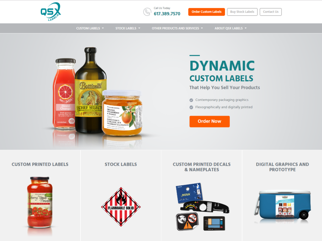
Here is the before and after of a website home page for a client of mine that prints custom labels for food companies. Their customers include major brands like Whole Foods, Williams-Sonoma and Dunkin’ Donuts, but you wouldn’t know it by looking at their original website, which was very cluttered.
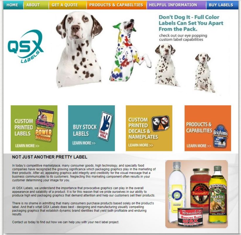
After the redesign they presented a strong message around their core service, and their website was full of conversion opportunities that made it easy for companies to order from them. Their new website is also mobile-ready, unlike their old one.
3. Information architecture and navigation
The information architecture (IA) of a site is how it is organized. The navigation is the on-screen menus, etc., people use to move through the content.
When developing your IA keep in mind what your visitor is coming to the site to do, and make it easy for them to do it. Also remember that many of your visitors – maybe a majority — are looking at your site on a phone, and you need an experience that will work for them. Because of its small screen, developing for mobile is more challenging and less forgiving. Start with the mobile experience and work out from there to small tablets and then desktop.
My philosophy of navigation is to keep it simple and to use Web-standard conventions like having the main desktop navigation across the top of the page. Maybe a game site could create a different navigation experience, but for 99.9% of sites you’ll want to make it as fast and easy as possible for people to do what they want to do and get to your content. Cars can be as different as a Hummer, a Ferrari and a Smart Car, but they all have the steering wheel in the front seat. Save your creativity for your content.
In your navigation, avoid drop-down and fly-out menus: they clutter up the screen and get in the way of other content. And they aren’t easy for search engines to analyze.
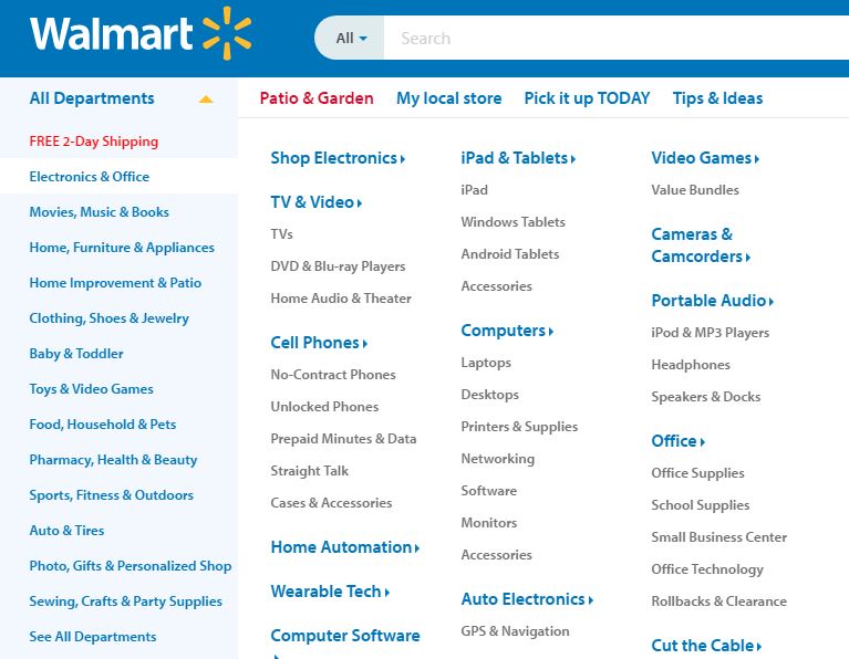
Comprehensive mega dropdowns, like the one on the Walmart desktop, are an exception. Of course, as Walmart does, you’ll need to program the site so a simpler navigation appears on phones.
4. Chunk your content
You should break up your content between pages, and within pages.
One contemporary website design trend is long, multi-topic scrolling pages. The only problem is people don’t like to scroll down long, multi-topic pages. Heat maps show that on almost any web page the farther down content is the less it is read. That’s why Google weights the content at the top of the page more heavily than that farther down for indexing what the page is about.
For one client I re-engineered their website from long, scrolling pages into many shorter, single-topic pages with a traditional navigation at the top. The average time-on-site for a visit immediately jumped up 50 percent.
So if you have content that you don’t care if people read, feel free to put it at the bottom of a long, multi-topic page. But if you think that all of your content is important, break it up into shorter pages and make it easy for people to navigate to them.
There’s nothing wrong with having long, single-topic pages of content; some studies have shown that blog posts with 2,500-3,000 words get higher readership and sharing than shorter pieces. But make it easy for people to scan and take in what you are saying by chunking your content.
- Break your content up into short sections with headlines and subheads to guide the reader and enable them to scan a page to see if they’re interested.
- Use numbered and bulleted lists.
- Use images to emphasize important points.
5. Segment and personalize content
In 1998 Jeff Bezos said, “If we have 4.5 million customers, we shouldn’t have one store. We should have 4.5 million stores.”[i]
That vision was way ahead of its time, but it has come to pass. Today Amazon has hundreds of millions of customers and hundreds of millions of home pages. They personalize based on previous purchases, browsing, and other factors.
You don’t need to have an ecommerce site to create a personalized website. Leading marketing automation and experience management platforms, and even lighter solutions aimed at smaller sites, let you personalize content based on such factors as which pages the person has previously visited, their geolocation, how often they visit, their relationship to you (customer, partner, etc.), what other site they were referred from, their corporate domain, and others. You could personalize the home page message for each known visitor.
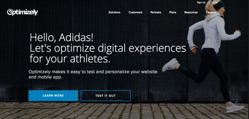
Optimizely customized their home page experience for 16 market segments, including key accounts that they were targeting with an account based marketing program. With targeted home page messages they caught the attention of visitors and achieved significantly greater engagement.
6. Provide calls to action
Your website should have many calls to action (CTAs) throughout it encouraging site visitors to do what you want them to (those goals you started with). You can offer visitors the opportunity to sign up for upcoming physical and digital events, register for a free trial, access content, make a purchase, make a donation, join, volunteer, and much more.
Pay special attention to the next chapter on conversion rate optimization for all sorts of tips on using CTAs and increasing conversions.
7. Social media buttons
Of course you want social media and email buttons on your website. But what do you want them to do?
On many corporate sites the social media buttons are low on the page – maybe even in the footer – and take you to that company’s Facebook, Twitter and other social media accounts with the hope that you’ll then follow them.

On news and ecommerce sites the social media and email buttons are often high on the page – sometimes at the very top – to encourage people to share that page’s content with their social media followers.
Which purpose is more important for your company?
8. Make your site accessible
Companies need to make their websites accessible to the visually impaired. Over three million Americans are blind and many use screen reading software to access the Internet. Other people are color blind: think of reading a subway map with color-coded lines when you can’t distinguish between colors. Companies may need to provide text explanations for critical color-based information.
Some of the things you need to do to create an accessible website include:
- Structure menus and pages so screen readers can navigate and read them
- Use descriptive alt tags on all images (alt tags are read by the screen readers to explain what the image is/says)
- Provide transcripts for your videos and podcasts
If you don’t want to make your website accessible to help the two-to-three percent of people who are visually impaired do business with you, or to be nice, you need to do it because it’s required by the Americans with Disabilities Act (ADA).
Enter the attorneys.
Hundreds of class action lawsuits have been filed to require organizations to make their websites accessible. For now these usually target larger companies with deep pockets: retailers have faced the most suits, as have restaurant chains, universities, banks, and other industries.
These suits charge that not only do the inaccessible websites stop the plaintiffs from doing business with the organization, they also make it impossible for them to apply for jobs. Most defendants settle.
Better get on it.
9. Optimize for search engines
Of course you want your website content to be read by as many people as possible, and so you need to optimize your site and content for high rankings on Google and Bing. Be sure to read the search engine optimization chapter in Phase 3 and apply its recommendations to your site.
10. Use the right technology
If you plan to update your site regularly — and you should, of course, if for no other reason than that Google likes sites with fresh content – and you don’t want your IT department to be a bottleneck, you will need a content management system (CMS) to empower many people to make website changes. Some vendors these days call their CMS an “experience manager”.
There are hundreds of content management systems available and some are tailored for particular uses such as community sites or ecommerce sites or educational institutions; at my former agency we developed and successfully marketed a CMS that was tailored to the needs of small colleges and private schools.
If many people in your organization who don’t have deep tech expertise will be posting content to the site, then you need a CMS that’s easy to use. When considering a new CMS don’t just watch demos but have the end users in your organization try the contenders out for themselves.
The CMS should also have a permissions structure that enables you to say which parts of the website each person can edit, and what their level of privileges are. For example, some people may be able to create and edit, but not publish without it first being approved by another person.
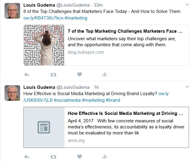
And the CMS should integrate with your other online channels. A subtle feature regarding posting to social media is that you should be able to designate what image will show in your posts. See in the image above how the post from HubSpot includes an image but the one from the American Marketing Association doesn’t. Twitter grabbed the image based on instructions in the HubSpot page’s metadata. Since social posts with images get much more engagement, even a subtle feature like this can make a real difference in your results.